OUR CLIENT

WHAT IS A SHAPESCALE? 💪🏾

ShapeScale is an emerging technology that uses 3D body scanning to help its users visualize their fat loss & muscle gains over time.

Shapescale users can see themselves with 3D photorealistic views. The scale scans the body in just under a minute and merges hundreds of photographs of its users with high fidelity from every single angle.

Shapescale provides access to localized metrics for body circumference, lean mass, fat mass, and of course, weight.

MY ROLE

WORKING AS A PRODUCT DESIGNER

I worked as a Product Designer on a team with 2 other designers. I focused on research, creating mockups, project management & prototyping the final product with a high fidelity user interface.

OUR PRIMARy GOAL

IMPROVE THE APP WITH DESIGN THINKING 🧠

Our goal was to create an improved version of the current Shapescale app using design thinking. Since Shapescale had not worked with UX designers prior, the CEO wanted us to uncover missing user needs, & properly validate the design decisions that had been previously implemented.

OUR DESIGN PROCESS

USING THE DOUBLE DIAMOND 🔷🔷

To discover the problem, we performed various types of businesses analyses, interviews, & sent out surveys in research.

To define a solution, we created user flows, an affinity map, & made a persona as well as their user scenario.

To develop that solution, into something tangible, we sketched out concepts, made high fidelity mockups, & worked on a prototype in Figma.

•  To deliver to our client, we conducted usability testing, developed a user interface, & performed accessibility testing.

PROJECT MANAGEMENT

MAPPING OUT THE 3 WEEK SPRINT 🏃

I  also created a Gantt chart for the team so we could map out the tasks for our project with clearly delineated deadlines.

being wagile

Although I created a Gantt chart of the tasks to accomplish, our project management methodology was mostly an agile & lean process. Because UX design is such an iterative process it was important for us to stay as flexible as possible so that we could return to our users, conduct usability testing, &  keep research at the forefront of our designs.

using scrummerfall

Our team also used the best practices from Scrum to organize & manage our process. We performed initial sprint planning to organize our tasks. We also conducted daily stand-ups to coordinate up to date information & remove any obstacles from the team's work. Finally, we organized a sprint retrospective as a team the successes & failures of the previous 3 weeks.

THE DISCOVERy

unearthing business & user needs 🧳

Our first milestone was to complete this preliminary phase of researching the problem. This helped us gather evidence & initial ideas of where to focus our attention.

STAKEHOLDER INTERVIEWS

SETTING UP EXPECTATIONS ✔️

CEO

Marketing

engineering

The first interviews were from the CEO, the Marketing Lead, & Engineering Lead so we could begin to diagnose the problems from a cross-functional perspective.


We interviewed them with these goals in mind:

•Establish expectations on in/out of scope items.
•Understand the vision & mission of Shapescale.
•Constitute definition of success & relevant metrics
•Ascertain concerns & technical constraints.
•Develop communication plan for project check-ins.

DESIGN CONSTRAINTS 

THE VALUE OF LIMITatiONS 🔒

The app design should be focused on iOS.
•Incorporate the "lens model" into the final design.
•A goal tracking feature must be included in the design.
•Multiple 3D models on a given page cause engineer headaches.

USER INTERVIEWS

BUILDING EMPATHY WITH 
USER EMOTIONS

😤
🥇

We conducted our initial round of user interviews in 30-minute time blocks with 8 users total over Zoom calls. 

3 users had ordered the scale as a pre-order.
3 users were beta testers with ShapeScale.
2 users were unaffiliated with ShapeScale.

We interviewed them with these 3 goals in mind:
• Identify user motivations to exercise.
Understand key measurements that are expected.
Determine pain points with other fitness apps.

USER INSIGHTS

Aha MOMENTS FROM THE GET-GO 

7/8 users did NOT like specific long term goals.
4 /8 users' motivation was to live a long & happy life.
8 /8 users currently use fitness apps & trackers.
8/8 users prefer to see data in a visual way.

COMPETITIVE ANALYSIS 

creating a feature inventory to understand the marketplace 🌐

In order to get ourselves acquainted with the market, I created a feature inventory of the 8 competitors main’s features & target markets for similar products.

This inventory set a baseline of what features would be expected in the app design.

DIRECT COMPETITOR

keep your friends close & your enemies closer 😜

The most direct competitor we found in terms of features, price point, & target demographic was Naked Labs.

Their product is a stand alone mirror for $1395 where you can see 3D models of yourself in the past & present.


Similar to Shapescale, they also offer body fat percentage, lean muscle, & side by side comparisons.

Naked Labs Scan Results

From our analysis, we determined one of Shapescale's greatest advantage over the rest of the market is that it offers you a personalized and textured avatar of yourself in the scan results instead of a grey blob.

All other market competitors (with the exception of Halo), only provide scan results as a grey clay model.

DESIGN INSIGHT

Display the textured avatar at the forefront of our designs & prominently throughout the app.

COMPARATIVE ANALYSIS

GLEANING FROM BEST PRACTICES 👀

LoseIt!
Fitbod
myfitnesspal
Strava

We also performed a comparative analysis on several apps that exist within the fitness industry to glean design best practices, experiences, & interfaces.

We chose these apps specifically to analyze based on feedback from user research about other apps they use to achieve their fitness goals.

DESIGN INSIGHT

Including a global navigation at the bottom for a familiar experience will pair well with a top navigation for qualitying information, such as date comparisons.

SURVEY DESIGN

GAINING INTEL ABOUT FIT-TECH 📈

In order to case a wide research net, we conducted a survey with 80 people from Reddit forums to gain intel about the needs of potential users who love fit-tech.

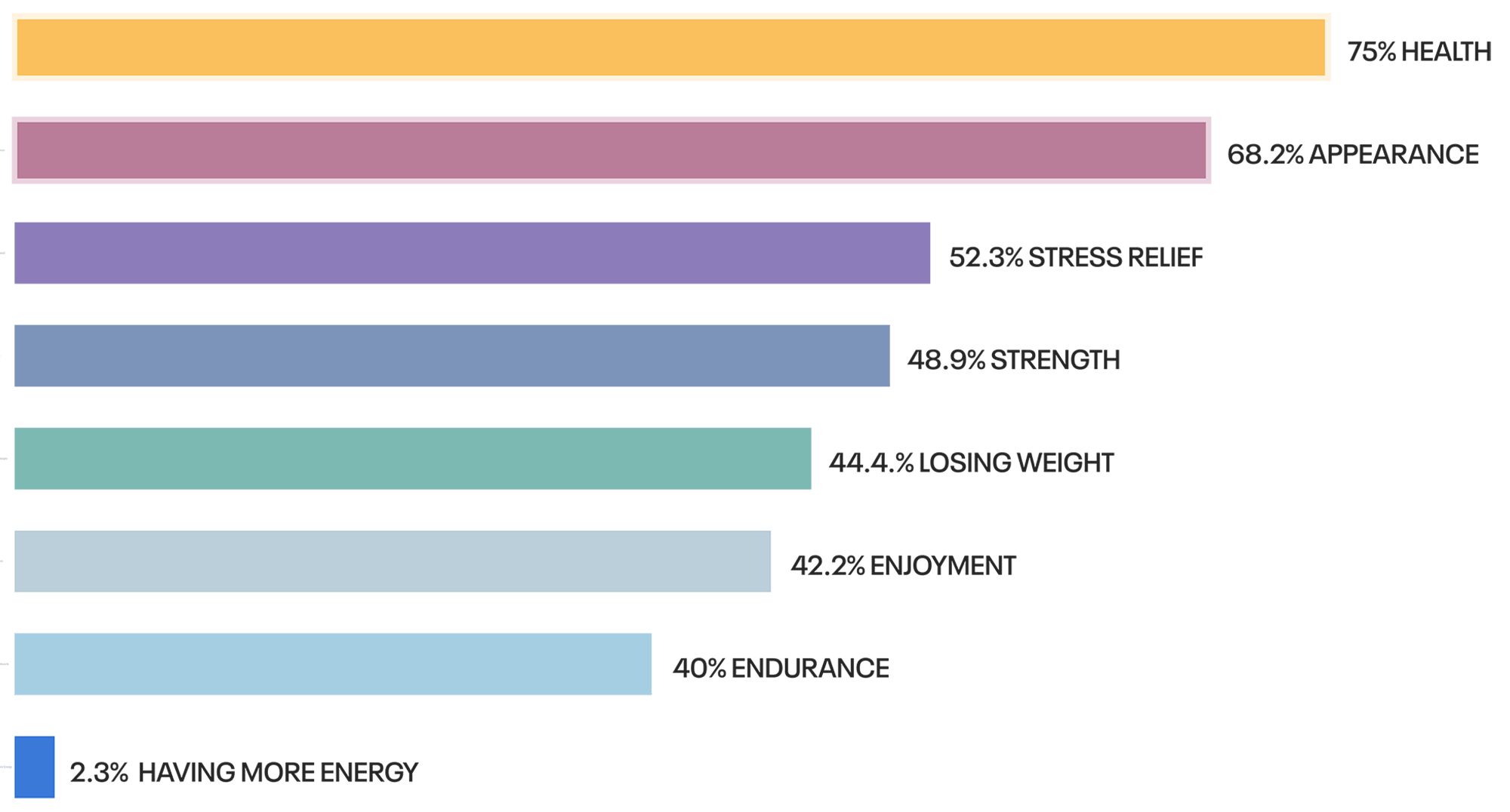
what are your motivations
for staying fit? 

We wanted to have a deep understanding of why people exercise, or stay fit at all. Knowing the main motivations would allow us to infuse the motivations into the design.

HOW OFTEN DO YOU
WEIGH YOURSELF?

We knew from our initial user research that there would be a need for comparison feature of scan results comparing different dates.

So, knowing how often most people weigh themselves could give us an initial hypothesis of the time ranges of dates we needed to prioritize.

WHAT EMERGING TECHNOLOGY
 DO YOU CURRENTLY OWN?

We also wanted to find the intersection of Shapescale's potential user base with emerging technology.

Knowing which products were the most popular could inspire the ultimate look, feel, & experience of the app design.

DO YOU SET GOALS FOR YOURSELF?

Knowing the importance of goal setting could influence the prioritization of features that get designed with the MVP.

We wanted to validate the business needs for a goal setting feature in our research process.

WHY DO YOU USE FITNESS APPS?

Pairing the knowledge of their main motivations for exercise with the reasons for downloading/purchasing other fitness could help prioritize the features we ultimately include in our design sprint.

DESIGN INSIGHT

Comparing between weeks should be prioritized in the initial design as most people weight themselves weekly.

AFFINITY MAPPING 

BEGINNING TO DEFINE THE PROBLEM 

Our second milestone was to begin to synthesize our initial research findings into defined problems for a specific persona. This helped us narrow our focus when hypothesizing possible design solutions.

From our initial round of 8 user interviews as well as 80 survey respondents, we created an affinity map of all the potential users' thoughts in a Miro board on digital sticky notes.

The sticky notes represent a single thought taken from a user from our interviews or from the survey results.

The post-its were color coded to indicate which user the thought originated from. This helped make sure as we gleaned insights from certain clusters, we were not biased towards making design decision from one user.

Black sticky notes represented survey responses.

As a group, we sat in silence for two rounds of 15 minute increments in order to sort the sticky notes based on global themes, & also bite sized motifs.

OUR GLOBAL THEMES WERE:
•Goals & Motivations
 App Likes & Dislikes
•Persona & Behavior
Measurements & KPIs
 Technology preferences

DESIGN INSIGHT

Analytics need to be extremely visual & easy to understand at a glance. Less focus on numbers & more on graphics.

UX PERSONA

BUILDING OUR CHAMPION 🏋️

The Excited Exerciser is pumped to exercise every day for the reward of feeling good physically.

They mostly use general feeling to track their progress, but they do like having numbers to validate those feelings.


They believe that ShapeScale will be the best fitness aid with its visually-appealing models and tracking of muscle versus fat.

DREAMS & ASPIRATIONS

To feel good physically, mentally, inside & out.
To see a trends of their fitness journey over time.
To be healthier than others in similar demographic.

MOTIVATIONS & INSPIRATIONS

•Wants to have a long & happy life with their loved ones.
• Likes having a sense of achievement.
• Is excited about having being physically fit & good looking.

FRUSTRATIONS & IRRITatIONS

• Annoyed by difficult to interpret or too much information.
• Confused by apps that change format constantly.
• Irritated by buggy or non-functional applications.

METRICS & INDICATORS

• Weight
• Heart Rate
• Sleep
• Muscle Gained
• Calories Burned
• BMI
• Waist Size
• Body Fat %
• # of steps

USER SCENARIO

UNDERSTANDING AN IDEAL SITUATION

When their ShapeScale arrives, the Excited Exerciser is going to scan themself and set their goals straight away. From there, they’ll treat the device similarly to their normal scale by weighing & scanning themself on it once a week.

After a month, they’ll look at a comparison between their body then & a month prior to understand the nuances how much muscle or fat they’re gaining.

They’ll also look for visualized trends of their weight, heart rate, calories intaked/burned, & sleep over that month by cross referencing other fitness apps like FitBit, Apple Health, & MyFitnessPal.

PROBLEM STATEMENT

REEXAMINING THE ISSUE

The Excited Exerciser is active and in good shape. They enjoy using fitness apps & tech related to fitness that can help motivate them to reach their goals through reminders and detailed information related to their weight gain/loss & heart rate.

Unfortunately, they find the ability to accurately see the amount of fat they are turning to muscle & vice versa impossible.

Because of that, they are looking for an accurate measurement of their fat and muscle gain and loss as well as other detailed measurements of their body.

DESIGN hyPOTHESIS

A EUREKA MOMENT

We will prioritize displaying a photorealistic 3D model of the user’s body labeled with information useful to the user, primarily including localized fat, localized muscle, & the changes in these metrics over time.

The Excited Exerciser will be able to access this model almost immediately upon opening the app.

We will also prioritize setting up short-term goals over long-term goals, as 100% of the beta testers we interviewed indicated that they disliked setting long-term goals.


USER FLOWS

TRANSLATING OUR MVP 
INTO PATHS

We designed out potential user flows from each feature to anticipate the potential paths the Excited Exerciser could take to accomplish each task.

Based on our preliminary research, we set up three primary tasks to be incorporated into our MVP of our 3-week design sprint.

1. Compare results from two different scans
2. View trends on a dashboard
3. Set up Goals


The most important feature would be the ability to compare results from different scans days. 

During our interviews, the users had also invalidated the need for a comprehensive goal tracking feature, however we did keep a dialed down version of it in our MVP because the survey respondents overwhelmingly indicated how important a goal tracking feature was for them.

SKETCHING OUT CONCEPTS

DEVELOPING POTENTIAL SOLUTIONS 📔

In order to relay information quickly to the team over Zoom, we sketched out our initial ideas on notecards & iterated on the designs synchronistically as we recalled the design insights from our research.

One insight that was clear from the research was the need for the textured avatar to be as big & omnipresent through the design so we included the figure in all of our sketches of the home screen.

CREATING COMPONENTS

constructing the
building blocks 🏗️

In order to save time, we skipped creating low fidelity wireframes for this project & dove straight into creating low fidelity components so that we could assemble & disassemble various forms of home page mockups.

This allowed us to quickly visualize the experience of combining so many navigation elements onto one tiny screen.

high fidelity mockups

REEXAMINING THE ISSUE 🔬

We focused heavily on the home screen because the layout, global navigation icons, & general infrastructure of this one screen would affect the design of the rest of the app.

Within 1 day of design, we ended up with over 25 variations of the home screen of app.

With some cursory feedback from usability tests from 5 different users, we were then able to narrow down specific elements that would offer the best user experience.

MULTIVARIATE USABILIty TESTING

SEWING DESIGN DISCORD 
INTO GOLD 🧵

With a seemingly infinite number of design variations, subtle disagreements surfaced on the ultimate direction of the user experience between the team. Seemingly at a standstill, we decided to alchemize the discord into a design studio.

Over the course of our last weekend of the design sprint, we worked simultaneously prototyping out 2 different user experiences so that we could set up a multivariate usability test with 6 different users on the following Monday.

The usability test, we hoped, would provide us with the insights we needed to glean from the best performing UX/UI elements of each prototype.

The prototype I created.

CONCEPT ONE

USERS LOVED 🥰

The overall navigation patterns.
The morphing feature between scans.
The animated lens icon.
The dashboard design & placement.

USERS DISliked 😕

The circular data graphs were confusing.
Users wanted to click on the body itself.

The prototype Bailey created.

CONCEPT TWO

USERS LOVED  🥰

The ability to click on the body.
The data visualization was intuitive.
Switching between lenses.

USERS DISliked 😕

Unconventional navigation patterns
The placement of the dashboard.

ITERATIONS

high intensity iterate training 😅

Due to the overwhelming consensus from users on what they liked/disliked about the two prototypes from the multivariate test, we were able to quickly iterate.

We took the navigation patterns from the first prototype & merged the data visualization from the second prototype to generate a more ideal user experience.

We also collapsed the Lens Navigation page into a horizontal scroll & reduced the opacity so that the users felt connected to their current screen when switching between lenses.

In order to create more accessibility within the product design, we went through several iterations of the main avatar's rings & heat maps to ensure they could be differentiated for people with various forms of color blindness.

FINAL PROTOTYPE 

HITTING OUR PR 📲

After 3 rounds of usability tests with 15 users, we finally hit our PR (personal record) with our final prototype of the Shapescale app.

Combining user needs, with intuitive navigation, & providing rich data visualization hit a home run with not only our users, but also our clients at Shapescale.

SETTING UP ATTAINABLE GOALS

During user interviews, most admitted they felt long term goal setting was the akin to a pipe dream. However, in our surveys, users overwhelmingly lauded goal setting as the most critical feature in their fitness apps.

Why we did what we did

Because of the split response from users & survey respondents, we chose to incorporate a very simple & uncomplicated goal set up. Users could indicate extremely attainable goals when it came to simple metrics like weight, body fat%, & lean muscle mass.

MEASURING BODY  CIRCUMFERENCES

The ability to see the girth of each area of the body was highly requested by users of many types. Some users wanted to show growth in an area, while other users wanted to see reductions in other areas. Whether you are trying to gain mass from bodybuilding, or lose weight to fit into your wedding dress, we needed a solution that could accommodate both user scenarios.

Why we did what we did

The rings around the body indicate measurable areas that Shapescale has scanned & the colors are associated with traditional heat mapping. The red colors indicate growth & the blue colors indicate reduction. Yellow and neutral colors indicate no change.

MEASURING MUSCLE GROWTH

For users specifically concerned about how much lean muscle they have. It is measured in mass, but typically displayed to the user as a percentage of body mass per area.  

Why we did what we did

We anticipated this to be one of the most popular lenses from our user research so we put it at the forefront of the Lenses supplementary menu. The ability to directly click on growth or reduction areas was an interaction that kept surfacing in usability tests so we highlighted them with a heat map that is overlaid on the body. Zooming into the selected area would hide the rest of the body, so we also incorporated the option to toggle between similar muscle within the zoomed view.

COMPARING TWO SCAN DATES

From our survey results we knew that most users would weight themselves about once a week. However, the option to compare week by week results could be extremely limited for other use cases. So, we include the option for users to compare specific dates against each other in the top navigation.

Why we did what we did

We knew most use cases would have users comparing general periods of time (1 wk, 2wk, 1 mo, 3 mo, etc) against each other so we we prioritized those time period in the top navigation. However, we also included the specific date which mimics the interface of an iPhone calendar because a majority of our users used iPhone.

VIEWING DASHBOARD FOR METRICS

The dashboard serves as a central hub for users who want to dive into specifics with the data about the trends of their weight, body fat percentage, muscle, shape index, BMI, & water retention.  

Why we did what we did

In our competitive analysis of other smart scales, this was one of the most conventional features we saw across the board.

USER INTERFACE

DELIVERING THE FINAL PRODUCT

Our final milestone of the project was to tighten up the user interface (UI) elements for consistency, usability, & accessibility.

We created a style guide for the engineers to use in their implementation.

We implemented several variations of two main fonts throughout the app.

Uniform was a pre existing font that we took from their main website & branding kit. We used it primarily for headers & button text.

We used TT rounds for paragraph text & also for navigation purposes because it scaled down crisply & was a complementary san-serif font.

The colors we chose for the accents of the app were purposely selected based on color theory psychology.

The green tones representing health, growth, energy & the blue tones representing persistency, stability, & expertise.

In order to soften the contrast of the screens, we also used off-whites & charcoal grays instead of solid whites/blacks.

We ultimately decided on flat & simplistic icons for global navigation elements throughout the app.

However, we also added more skeuomorphic icons into the Lens Menu & Dashboard Menu.

Because Shapescale is an emerging technology & most users were not familiar with all of the concepts in the app, many users expressed frustration about the previous icon selection in the Lens Menu.

By providing a more realistic, 3-dimensional, & color icon, users could more clearly associate the icon with its purpose in our final round of usability testing.

FINAL REFLECTIONS & KEY TAKEAWAYS 

CONFLICTS CAN  BE BENEFICIAL

You aren't going to always agree with your fellow designers, stakeholders, clients, or even users. But each person may be holding the missing piece to make the ultimate design the best it can possibly be.

PRODUCT INCLUSIVITY IS
NOT AN AFTERTHOUGHT

The more you can integrate product inclusivity into the design process from the beginning, the better the final product will be. Not only will you be designing from a more holistic place for society, you will also not have to back track your work and "add it in" afterwards which takes a lot more time.

ALIGN BUSINESS CONCEPTUAL MODEL 
TO USER MENTAL MODEL

If the users cannot relate to the concept you trying to shove down their throats, it's not going to work. Make sure to create familiarity in your designs so that users have something to hold onto, especially for new, emerging, or unfamiliar technology.

USERS SOMETIMES "LIE" TO YOU

In our survey users told us they loved goals & goal setting. In our user interviews, users told us they hated it. So, which is true?  Neither & both. You have to read in between the lines from various research perspectives to get the whole truth.

THORouGHLY CAPTURE YOUR WORK

Overly document & capture your process as if you are a soccer mom at your child's first soccer match. It's better to have too much documentation rather than none. Trying to remember everything that happened after the fact just is not going to happen.