Designing A Friend-zone for an LGBTQ+🌈 Christian dating app
A 3-week design sprint to research, conceptualize & execute on the product design of a dating app for LGBTQ+ Christians looking to connect with friends, as well as dates.
The ContextTHE COMPANYThe challengeMY roleproject kickoffswot analysiskey constraintssurvey designguerilla user researchUSER INTERVIEWSAFFINITY MAPPINGUX PERSONAstoryboardproblem statementdesign hypothesiscompetitive analysissketchesprototypeusability testinguser interfacefinal reflectionsTESTIMONIALSIn 2015, the Supreme Court delivered the monumental decision to make same-sex marriages legal across the country. It sparked celebration around the world and #LoveisLove has become a permanent echo of this around the internet to this day.
With everything that happened in 2020, it may be hard to remember the seemingly never ending fight for marriage equality. However, the fight for acceptance is all too familiar, even to this day, among the LGBTQ+ Christian community.
Being too gay for Christians, & too Christian for the gay community, many LGBTQ+ Christians have no place to call home. They need a place to feel supported & process the complex layers of their identities.
I was enlivened by the opportunity to work on such a socially inclusive project in hopes of bringing people from a such a niche community together for fellowship, friendship, & romance.
I signed a non-disclosure agreement & have omitted certain confidential information in this case study as they pertain to non public facing features. All the information in this case study is my own and does not reflect the views of believr or their employees.
WHAT IS BELIEVR? 🙏🏾

Believr is a dating app where LGBTQ+ Christians can come to find connection, belonging, & love. The key features the app markets to distinguish itself from the competition are its values-based matching algorithm & community chat.
A NICHE WITHIN A NICHE 👯

People who are passionate about Christianity & also identify as a member of the LGBTQ+ community have virtually no spaces (digital or physical) where they can safely meet others who share the same values of them.
Tailoring an improved user experience for this community while maintaining the business goals of increasing paid subscribers was at the forefront of our project goals.
The beta version of the app was released to the public on Apple App Store & Google Play less than one month prior to this project. There were many opportunities for usability improvements, however we wanted to do thorough user research before defining our MVP for our 3-week design sprint.
Coming out as a ux.icorn 🦄
.png)
I led the product design experience for the 3-week design sprint with 1 other user experience designer remotely over Zoom.
• We conducted extensive research through user interviews, surveys, usability testing, & various business analyses.
• We developed a design persona from a 600+ post-it affinity map in order to differentiate our work from their marketing personas.
• We created a user scenario from the fleshed out persona & created a storyboard of believr's user experience.
• We sketched out 3 design concepts to generate ideas through brainstorming techniques & get quick feedback from stakeholders.
• We designed high-fidelity wireframes & a prototype in order to conduct a 2nd round of usability tests & iterate on a final design.
Applying Product INCLUSIVITY to the 5 stages of design thinking 💞

Building inclusive products should never be an after thought, so we made every attempt to incorporate inclusive design principles from the beginning to the end of our design process.
From our initial pitch with the CEO, we knew the majority of the app's current users were cis, male, white, able bodied, & in their mid 20s to mid 30s.
In order to build the product in the most inclusive ways, we would have to make sure to empathize, define, ideate, prototype, & test our design with people from different demographics to get a 360° representation of user needs.
In my opinion, this should *always* be a part of any design process. However, it is particularly critical to make this distinction when working with the LGBTQ+ community.
The app is more than a dating app. It is bringing an underserved community together & should also have UX/UI elements that mirror a social network.
Not today satan, not today 😈
1. Time was our biggest constraint with a 3-week sprint window.
2. Engineering limitations especially concerning modals & popups.
3. Pre-existing architecture should exist for our designs so they can be actually be implemented in a reasonable timeline.
4. Business objectives to keep intrigue to pay for subscriptions.
5. Values alignment to keep the app from feeling like a hookup app.
6. Christian faith is key. Believr is open to people of other faiths joining, however, it is not designed towards other religions.
7. Non-existing budget was also a concern for this sprint.
8. No access to their lead UX designer because he was on vacation.
9. GDPR data privacy laws would delay the launching the app outside of the United States.
10. Brand aesthetics & style guide are already in place.
COME THROUGH! THE INSIGHTS ARE OPULENT 🏁

We sent a 27 question survey to 735 users of the app
& received 109 responses with a14% conversion.
We were successful in all our main goals with our survey design.
✅ Validate users were using the app as a social network.
.png)
✅ Mine for hidden motivations why people were using the app.

✅ Uncover the sticky areas where users are frustrated.

✅ Understand if users see the value in a paid suscription.

✅ Unearth patterns in requests for potential features ideas.

✅ Identify a diverse set of users who we could interview.

There is overall lack of satisfaction with how "connections" aka matches are occuring on the app. This could be a component of our MVP.
CROSSDRESSING AS CHRISTIAn 🤫
The easiest way to access users from day 1 of the project was to create a create a profile on the existing app. I was able to connect with potential matches & chat with people from the community with complete ease... just don't tell my Jewish husband!
Meeting users where they were at created a sense of ease, trust, & familiarity almost immediately.
Building authentic connections was a fun way to learn more about the users & also proved to be an effortless way to acquire users for interviews & usability testing.
P.S - In case you are wondering...I never lied in my profile or pretended to be more devout than I actually am. I was completely authentic in all of my exchanges & always revealed I was a product designer working with the app in all initial conversations.
KIKI TO SPILL THE TEA 🍵
We divided our interview strategy into 3 parts with 12 users to make sure we were getting a comprehensive understanding of the challenges the users were facing in their lives & on the app.
1. We interviewed 6 existing beta users of the app which we found from the community space & connections features.
2. We also conducted usability tests on the existing app with 3 LGBTQ+ Christians who had never seen the app before.
3. Finally, we interviewed 3 additional users who had recently canceled their paid subscription with the app.
"Believr as a dating app is at the bottom of the list for me. I was interested in the community space."

FRUSTRATION OVER
FILTERING LIMITATIONS
Users were overall frustrated by the current limitations of filtering. They wanted to filter by distance, denomination, & relationship type.
SKEPTICAL ABOUT VALues perceNTAGE
The algorithms matching the users were often showing matches in ranging from 10-50% which made the users question the validity of the connections.
.png)
CONFUSION OVER UNFAMILIAR ICONS
Users were often confused by icons that did not follow conventional standards. These icons were meant to represent "next" & "connect."

OVERWHELMED BY COMMUNITY SPACE
Users loved the concept of the community chat, however all users were overwhelmed by the execution of its current UX state. Currently, it has one chat area where all 700+ users are chatting at the same time.
.png)
There needs to be a way to clearly & more effectively filter connections, especially as it relates to friends vs romance.
AFFINITY MAPPING TO THE GODS📍
Timelapse video of our affinity mapping process.
We created a qualitative map of users thoughts, observations, & survey result data in order to define our UX persona, problem statement, & design hypothesis.
634 post-its later & 6 hours of later we had organized the enormous amount of qualitative data into 42 themes.
Restructuring the free vs paid features of the app could increase user satisfaction & user retention & boost revenue.
HALLELOO TO OUR DESIGN DIVA 💁

Skye
QUOTE 💬
"There are a lot of apps out there that are toxic. I'm so excited for the essence of this app where people are just wanting to find themselves. Although it's been hard finding a way to navigate between friends & romance."
GOALS 🎯
•To meet new friends & go on dates.
•To build strong connections with LGBTQ+ Christians.
•To find resources to help them with their coming out journey.
BIO 📖
New to their journey as an LGBTQ+ Christian, Skye is looking for community & hopes Believr will the solution. Although they have a committed relationship in mind for the future, connecting with LGBTQ+ Christians is their priority.
VALUES 💞
•Devoted
•Intentional
•Extroverted
•Moralistic
FRUSTRATIONS 😞
•They don't have queer Christian friends.
•Hookup culture is off-putting to them.
•Having a hard time interpreting doctrine in context of their sexuality.
MOTIVATIONS ↗️
•They want to explore their identity.
•Finding relief in knowing there are others like them.
•Knowing that there is a possibility to find someone to love.
PROPORTIONIZING INTO COMICS
We also created a storyboard of Skye's current experience within the context of the app & their journey as a LBTQ+ Christian.
POOR RELATIONSHIP
EXPECTATION SETTING CAUSES
UNCOMFORTABLE INTERACTIONS
Believr was designed as a dating app to connect LGBTQ+ Christians together. We have observed it isn't meeting the goals of who is there for friendship & who is there for romantic purposes. This is causing a disconnect between the user's experience and their expectations.
"how might we improve the app so our users are more successful in creating the relationships they intend?"
INTRODUCING THE FRIEND ZONE
The problem can be resolved by reframing several steps of the user task flow so that finding friends is equally weighted in a UX/UI context as finding dates currently is.

1. Reframe the onboarding process to be more clear about Believr being about community as well as dating.
2. Enhance the profile page so that is incorporates more filtering criteria. Examine how the match information is presented.
3. Integrate an option to browse through friendship matches.
4. Flesh out options for what is free vs paid to add value to Spectrum membership.
5. Enhance private messages with prompts & conversation starters.
ORDERING A 2-PIECE & A BISCUIt 🍽️
Because we knew we wanted to explore the idea that people could find frienship through Believr, we knew we had to perform a little more research on social networks. In addition, looking into how dating apps had already tackled a social component.
We started our analysis with dating apps that were repeatedly mentioned in our survey results & user interviews.
Bumble has a "BFF" mode.
HER has a "follow" function.
Hinge connects people through comments.
There are several overarching social concepts to explore from other dating apps that our users are already familiar with.
We moved on to performing an analysis of social networks that are known for their expansive communities.
We were trying to figure out if there were any patterns to which led to the success of these platforms.
When it comes to social media, content reigns. The success of all of these communities is directly attributed towards motivating users to create their own generated content.
Video, in particular, is driving upwards of 82% of web traffic according to Cisco's annual white paper in 2020.
Digital communities & content generation are inseparable. Incorporate an experience where users can create their own content.
HOW TO BE A UX DESIGNER
WHEN YOUR POWER GOES OUT ⚡
In the middle of the design phase of this project there was a mega winter storm that spread across the country leaving millions of people without power....I was one of those lucky people!
Without heat, hot water, or reliable internet, I grabbed my markers, notecards & scissors to stay productive.
DECIDE WHO YOU WANT TO MEET
WHEN SETTING UP YOUR PROFILE

This is a model that is employed by both Tindr & Bumble. Essentially when you set up your profile at the beginning of the onboarding you toggle to switch either friend mode, or date mode. You can only browse matches who are also toggled in your same mode.
INTEGRATE a "follow" feature on the profiles
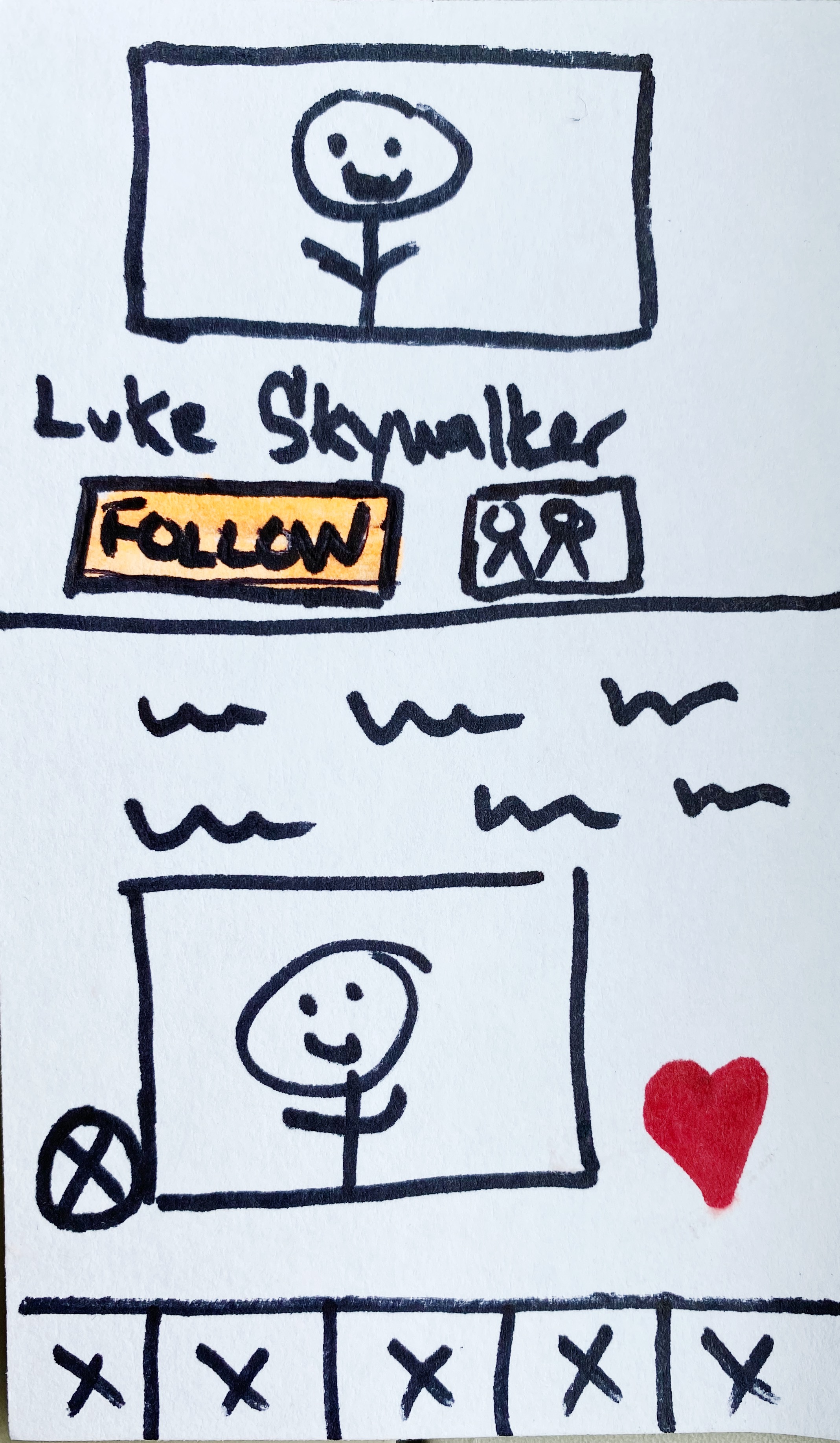
Clearly inspired from social networks, dating apps like HER & Hornet, have already successfully implemented this approach. These apps have even developed user generated news feeds so your friends can follow your content.
ALLOW THE USERS TO DECIDE
IN THE MOMENT

This specific model was inspired by Hinge's "heart" commenting, however, has not been implemented on any dating app before integrating a friendship UX/UI. This would allow the users to click a thumbs up icon if they wanted to be friends, or a heart icon if they wanted to go on a date. Users could decide in the moment, on a profile by profile basis how they wanted to develop their relationships.
C3...SHANTAY, YOU STAY 🏆

After a meeting with the 3 stakeholders for the project, it was decided that concept three should be fleshed out & pushed forward into usability testing.
They chose this design specifically to test because of its uniqueness, nerve, & talent.
YOU BETTA WERK 🛠️
We created a 40 screen prototype in Figma in the final week of our design sprint with 5 core features as part of our MVP.

These 5 features were chosen specifically after careful analysis from the quantitative & qualitative data we had compiled from user interviews, the survey, usability testing, & business analyzes.
We ran usability testing on these features with 5 users.
FILTER BY LOCATION, GENDERS, & DENOMINATIONS
Users can set different connection preferences for who they want to meet for friends & who they would like to meet for dates.
"Oooo! This is a feature I like...I am loving this! If I'm looking for dates or marriage I really care about filtering by denomination. But with friends I don't mind as much."
INDICATE IF YOU WANT
FRIENDSHIP
OR DATES WITH LIKE
& HEART ICONS
As users are browsing through their matches, they can decide in the moment if they are interested in pursuing friendship or romance.
"I love how there is no pressure to be romantic. It's nice to communicate that we would be better friends than partners."
INLINE REPLIES, MESSAGE REACTIONS, & INBOX CATEGORIES
Inbox categories separate out different types of messages into how they pertain to dates, friendship, or community spaces.
"...currently this feature is giving me A.I.M. texting feels... and this new design makes it look much more modern..."
INCREASING THE PERCEIVED
VALUe OF THE PAID
SUBSCRIPTION
We added 4 potential feature ideas & also created an updated business model where users can subscribe by 3 & 6 months periods.
"It's really cool that this app is being so well thought out. I'm excited to see how these new features bring in a different set of users to the app."
VIDEO PROMPTS TO
START CONVERSATIONS
Every day, users can submit up to a 60-second video answering a creative question in hopes of building community & starting interesting conversations.
"Stories are another way to get know someone. You can cultivate friendships & relationships in an authentic way."
HOW IT STARTED VS
HOW ITS GOING 🔀
We sent a follow up survey to get more qualitative & qualitative data from users we had interviewed or who had performed usability testing specifically about the before & after screens of our design process.
Here's what we found.

64% of users preferred our updated connections filters design because it offered less confusion around finding friends versus finding romance.
"I have heard from friends also on the app that it would be nice to have the option to explicitly NOT be seeking dates."

82% of users preferred our redesign of the profile page because they found it clearer, more engaging & more intuitive.
"It is very to the point. It is more clear & engaging. I like that it shows the profile & brief info of a person."

73% of users preferred our redesign of the connections explanation screen because it offered up goals & specific purpose for the app.
"The icons next to the explanations give more clarify for those of us who are more *cough* picture learners."

82% of users preferred our redesign of the message inbox because it is more organized, familiar & encourages exploration.
"The first is boilerplate, it seems. The second allows friend-zoning. I like that."

73% of users preferred our redesign of the direct message screen because it is more modern, familiar, & intuitive to use.
"The redesign is just more modern & allows for more feelings while conversations are happening."
.png)
82% of users preferred our redesign of the empty connections screen because it was less busy & frankly just more cute.
"It looks less like a boring document. I mean, who can be upset when they don't have connections while you're looking at a adorable sleeping unicorn??"

73% of users preferred our redesign of the Spectrum membership page because the graphics were prettier & because of plan options.
"The graphic is prettier & it seems less wordy. I like that the price options are clear & the layout is way more fun."
Look at that body-ody-ody 👀
.png)
As we were designing out the prototype, we wanted to make small tweaks to the user interface to ensure the app was following up to date conventions, trends & guidelines.
CREATING FAMILIARITY
WITH ICONS

Because some of the bottom global navigation icons were unfamiliar to the users, we reinforced their meaning by adding the icons to the top of hyperlinked screens with the text meaning under them.
We also swapped out completely unrecognizable icons, such as the original "connect" & "next" icons with ones that were more intuitive.
GIVING OFF A FRIENDLY VIBE
WITH ROUNDED UI
-min.png)
The concepts of safety, friendliness, & trust were repeated themes in our user testing. To strengthen those ideas throughout the app, we rounded the corners of images, buttons, cards, & miscellaneous elements.
INTRoducing friendly cyan

In order to distinguish the different experiences of chatting with people whom you want to be friends with from those you want to date, we introduced a new color into style guide.
We chose this color specifically because on the color wheel it is complementary to the pre-established pink tones. Psychologically, cyans instill peace & calmness & rational thinking.
LESS CONTRAST IN
BACKGROUNDS

Although high contrast is great for readability, too high of contrast can cause eye strain for many users. We made small tweaks to the backgrounds of the app to adjust them to dark grays & off whites.
This created a softer & friendlier look in addition to increasing readability.
WHY SIZE ACTUALLY
*DOES* MATTER

No one knows what to do with an extra small thingie. I mean target points, of course! Get your mind out of the gutter.
We increased the size of controls like back arrows, hamburger menus, checkboxes, & message windows to at least 45 pixels for target areas.
These are standards set forth from Human Interface Guidelines by Apple & Material Design Guidelines from Google.
BEING A UX DESIGNER IS KIND OF
LIKE BEING A LAWYER ⚖️

You are one of the biggest advocates for the user that exists. It's your job to put together a strong case with solid qualitative & quantitative evidence to present before the court, judge & jurors.
WHAT YOU WANNA DO IS NOT
NECESSARILY WHAT YOU'RE GONNA DO 🤷

At the beginning of this project, I internally wanted everything to be clear cut & design this into a "regular" dating app. However, as we interviewed users and understood their needs for community, we knew we had to switch directions. Ultimately, I wouldn't have done it any other way.
GET OUT OF YOUR
COMFORT ZONE 👟

I was absolutely shook to learn that in 2021 there are still people who are struggling to claim their gay cards. I assumed because I've been out for so long & am surrounded by others who are as well, that my experience is standard across the board. It's important to work outside of your comfort zones to understand your users & have a better understanding of the world.
IDEATE LOTS OF IDEAS FOR STAKEHOLDERS WHO LOVE
TO SAY NO 💬

There are some stakeholders who absolutely love to say no. In the ideation phase, come up with as many ideas as possible. They can't possibly say no to all of them!
EXPECT THE UNEXPECTED 🤯

In our final presentation meeting while I was presenting the final slide of our project, the lead UX designer for believr returned from his vacation from the last 3 weeks of our design sprint. It threw us off in our presentation as we were not prepared to have to defend some of the decisions that had previously been discussed with other stakeholders.
DON'T FORGET TO JUST HAVE FUN 😗

Inspiration can strike anywhere at anytime. It's easy to get lost for countless hours/days/weeks in our design software & video conferences these days.
Schedule in time for yourself to do other things you love. If you can't love yourself, how in the hell you gonna love someone else?
Can I get an amen up here? 🙏

ADAM
I really appreciated your passion & energy towards the project. The designs you came up with definitely challenged & improved how we think about the user experience. I know we will be using the insights that you found.

PASCAL
It's engaging, an easy connect point between people & simple to use. It looked great! The community desire over dating was very surprising to me! Interesting findings overall in the research, thank you!

DAVID
👏🏽 OBSESSED 👏🏽 In all seriousness I really do LOVE this feature. It makes sooooooooo much sense to me. Being able to look for both friends & romance at the same time would really just set us apart from EVERYONE out there.


-min.png)


